Some clothing companies adapt well to changing times, and Gap seemed to be one of those venerable brands.
 |
With little fanfare, the company decided to redesign its logo and post it on its website. Not too long after, waves of criticism from design firms, mainstream publications and just-plain bewildered bloggers started rolling in.
The company, which has apparently heard the cries of outrage, turned the redesign into a crowd-sourcing exercise on its Facebook page. No word yet on whether that was the official plan all along, or if it was just a knee-jerk reaction to all the bad press.
• 'Looks Like it Cost $17 From an Old Microsoft Word Clipart Gallery' notes Abe Sauer at Brandchannel, who deemed it a "monstrosity." The writer explains: It "demonstrates a prototypical brand panic move. With things not going in its favor, the brand decides to change the one valuable element it has going for it."
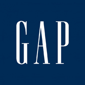 |
• Makes Old Navy 'Look Like a Luxury Brand' scoffsArmin Vit at Brand New: "The shaded square on the corner doesn't help at all either -- I'm not one to critique something by saying it looks as if it were done in Microsoft Word but this one is just too unsophisticated to warrant anything more than that."
• This Doesn't Make Any Sense writes David Brier at Fast Company. "It's all a cosmetic band-aid which is so unbelievable for a brand as big and 'mature' as Gap. I'll be surprised if a few people won't lose their jobs as this is basic Branding 101."
• Gap Sales Are Declining Anyway dismisses Jim Edwards at BNet. "There's a clue to what might have triggered the misstep in the fact that same-store sales at Gap are down 4 percent. ... Brand managers need to resist that temptation when they see revenues decline. There are lots of reasons sales might be down -- the recession, lack of discounts, off-trend product -- and not all of those respond to a new trade dress."
• Everybody Hates The Logo ... Except Us Time Newsfeed writer Nate Jones goes out on a limb saying that he "personally does not mind Helvetica, and so this new logo brings to mind visions of a streamlined, technologically dominant future America where everyone wears white suits and cool glasses. Sure, it's generic, but don't you know that in the future everything looks alike?"

