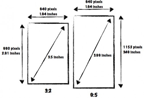
All models of the iPhone and iPod touch released to date have carried a 3.5-inch screen with a 3:2 aspect ratio, allowing developers to target their apps at a single screen size. With the addition of Retina displays in 2010, the screens now come at much higher resolution, but the extra resolution is dedicated to increasing the visual quality of content rather than increasing screen real estate. The introduction of the iPad in 2010 added a new display size to the mix, but the considerable difference in screen size compared to the iPhone made it reasonable for developers to create custom interfaces, either in the form of universal apps or separate iPad and iPhone apps, for use on the different devices.
But moving to a slightly-larger iPhone display would seem to cause issues for Apple and its developers, with the company seemingly having two options: either increasing pixel size to keep the same resolution but on a slightly larger display; or maintaining pixel size and increasing resolution correspondingly. The former solution would allow existing iPhone apps to fit the new device's screen with no modifications but with only limited utility, while the latter solution would seem to require developers target yet another screen size with their apps.
But as outlined at The Verge, one method for achieving the latter solution in moving to a 4-inch display would be to change the aspect ratio, maintaining the existing 640 pixel width but stretching the height of the display until it reaches a 4-inch diagonal. Simple geometry yields a screen height of roughly 1152 pixels for a 4-inch display, compared to 960 pixels on the current 3.5-inch display.

The forum poster, a user by the name of modilwar, was inspired by a comment from a caller named "Colin" on The Vergecast show who suggested that change in aspect ratio as a possibility for a larger display. Using that idea, modilwar developed a series of illustrations showing how this could be achieved.
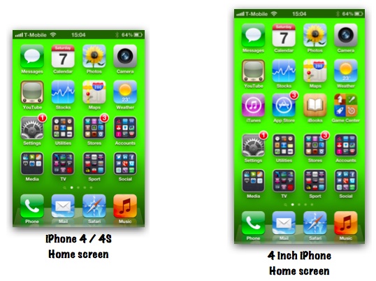
At the most basic level, an increase in the height of the display would allow Apple to show five rows of icons on each page of the iPhone's home screen, up from the current four rows. Apple would also likely find it fairly easy to augment its own apps to take full advantage of the increased vertical screen real estate.

As for third-party apps, modilwar notes that many apps already utilize standard interface elements such as navigation buttons and bars at the top and bottom of the screen supporting a larger main content window in the middle. In the case of these apps, the main windows could simply expand vertically to show more content than on the current iPhone. Examples include browsers that could show more of a webpage, Twitter apps that could show more of a timeline, and mapping apps that could show more map tiles.

Other apps with custom user interface elements would require a bit more work, but in the meantime could simply be displayed at their current sizes with a 96-pixel wide black bar at top and bottom on the larger 4-inch display.
This new 4-inch screen with a 9:5 aspect ratio would also perform much better at displaying widescreen 16:9 video content, leaving bars on either side of the screen that are only 7 pixels wide, compared to 50 pixels for unzoomed content on the current iPhone.
Modilwar passes off his post as an intellectual exercise simple showing one way in which Apple could make a change to the iPhone's display with a minimum of disruption to the iOS ecosystem, but in a bit of a curious turn the post was picked up by Daring Fireball's John Gruber, who hints that the original idea may not be all that far-fetched.
Methinks “Colin” wasn’t merely guessing or idly speculating.
Since Gruber has been known to speak coyly about his occasional inside knowledge, it is unclear whether he has independent knowledge supporting the idea of a taller display for the iPhone or if he simply has a gut feeling that "Colin" may legitimately be tipping some information at least partially tied to Apple's thinking. LINK


